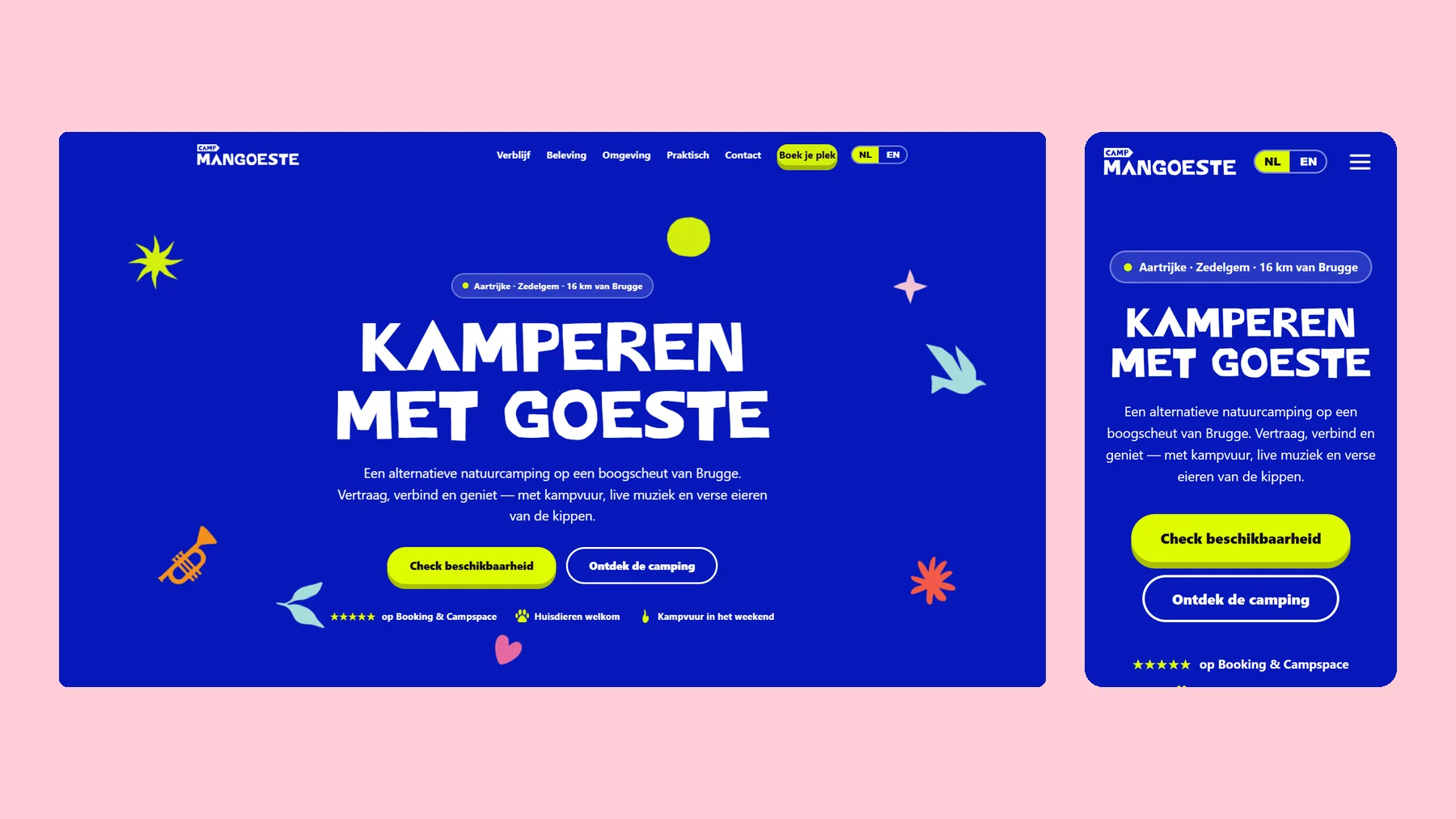
Camp Mangoeste Website
Camping with goeste, on your phone too.
Desktop and mobile side by side
All projects
Camp Mangoeste Website
Desktop and mobile side by side
All projectsCamp Mangoeste is an alternative nature campsite in Aartrijke, a stone’s throw from Bruges. Campfire, live music, fresh eggs from the hens. Studio Klare had made the identity. We made a site as cheerful as the campsite.
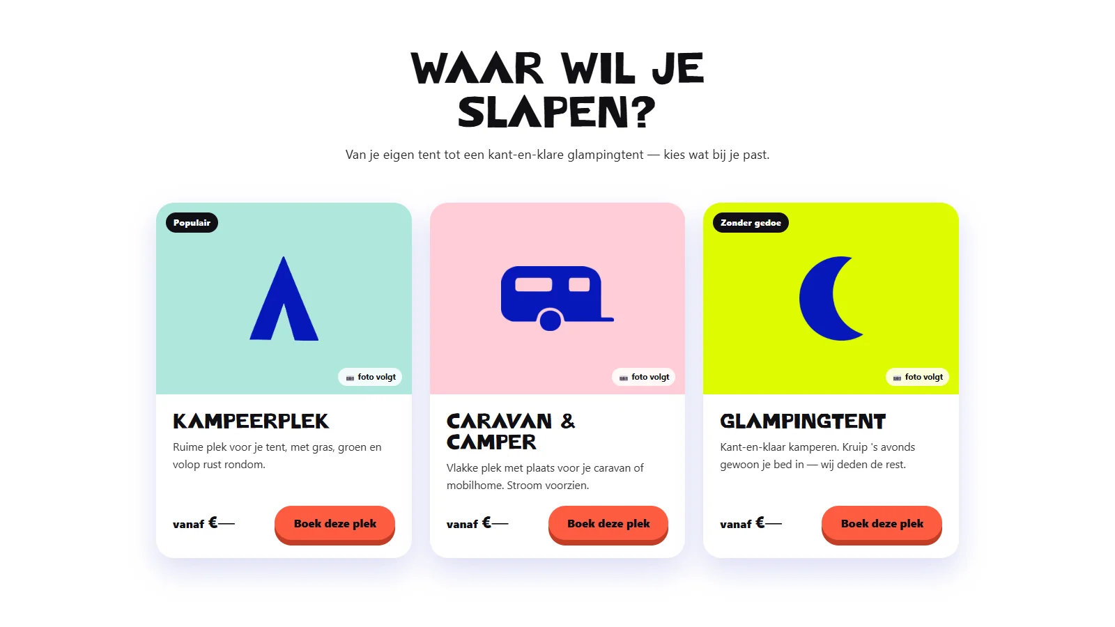
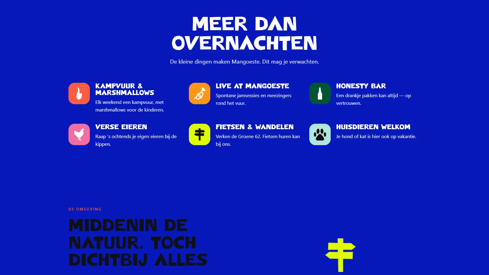
A site that gets guests to a pitch in a few clicks, and lets them feel why Mangoeste isn’t an ordinary campsite. Two languages, on the identity Studio Klare designed.
One homepage, one sweep: sleep, experience, book. Pitches as cards, the experience in icons, guest reviews, practical questions. Colour and type come straight from the brand. The structure is ours.
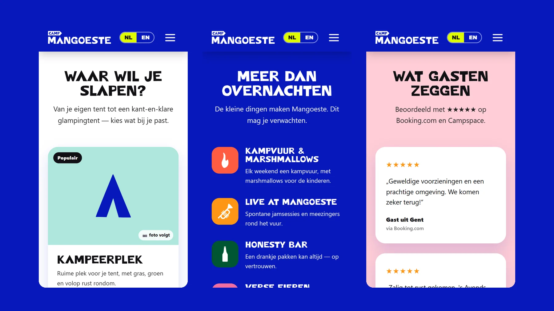
Site structure · web design on the existing identity · bilingual site in Dutch and English · booking entry points · editable copy. Logo, typeface and illustrations are by Studio Klare.